


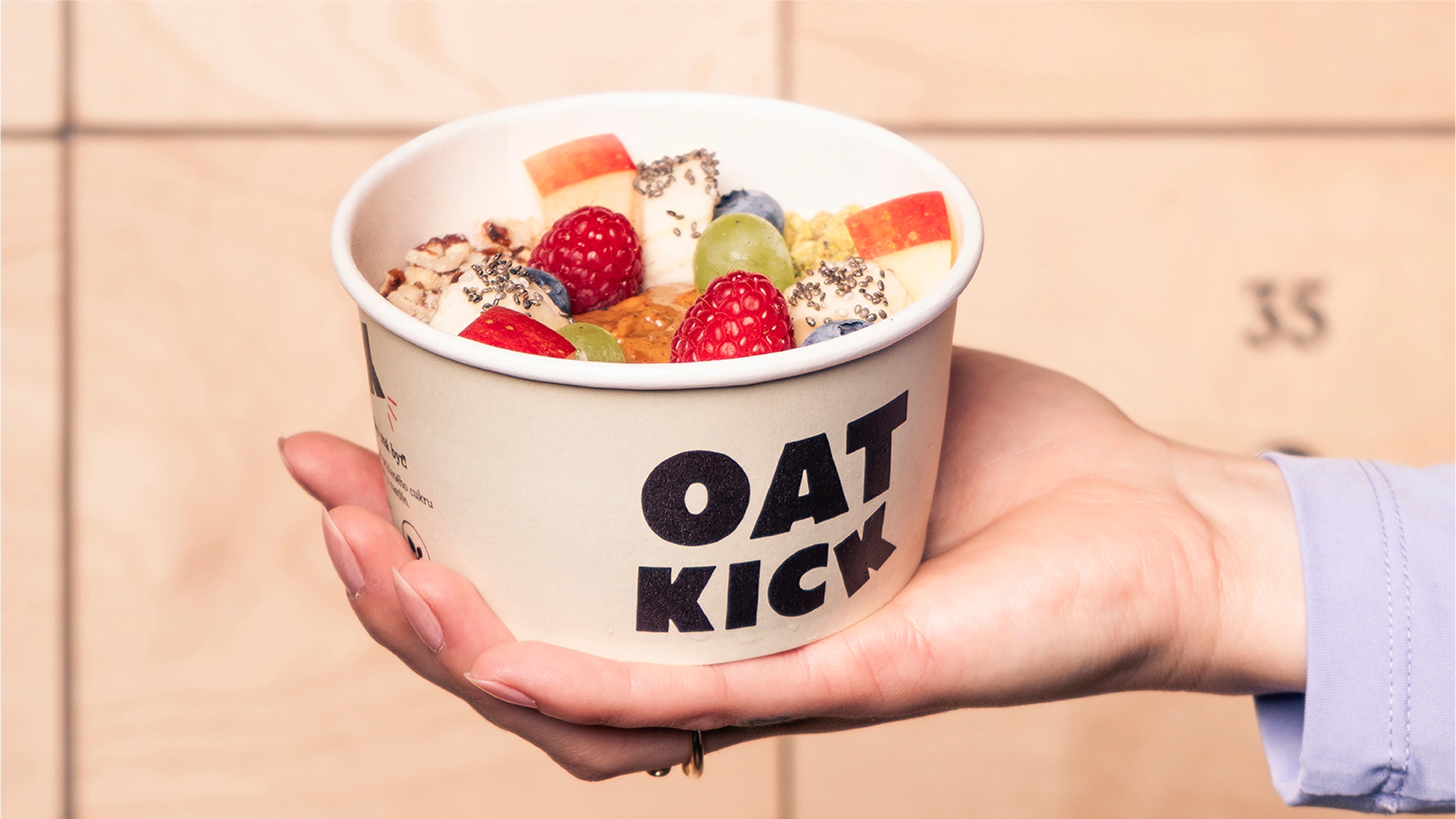
Oatkick. Visual identity design and package design for performance oatmeal brand ready for international expansion to Austria and beyond.

Project Info
Balancing Warmth & Energy
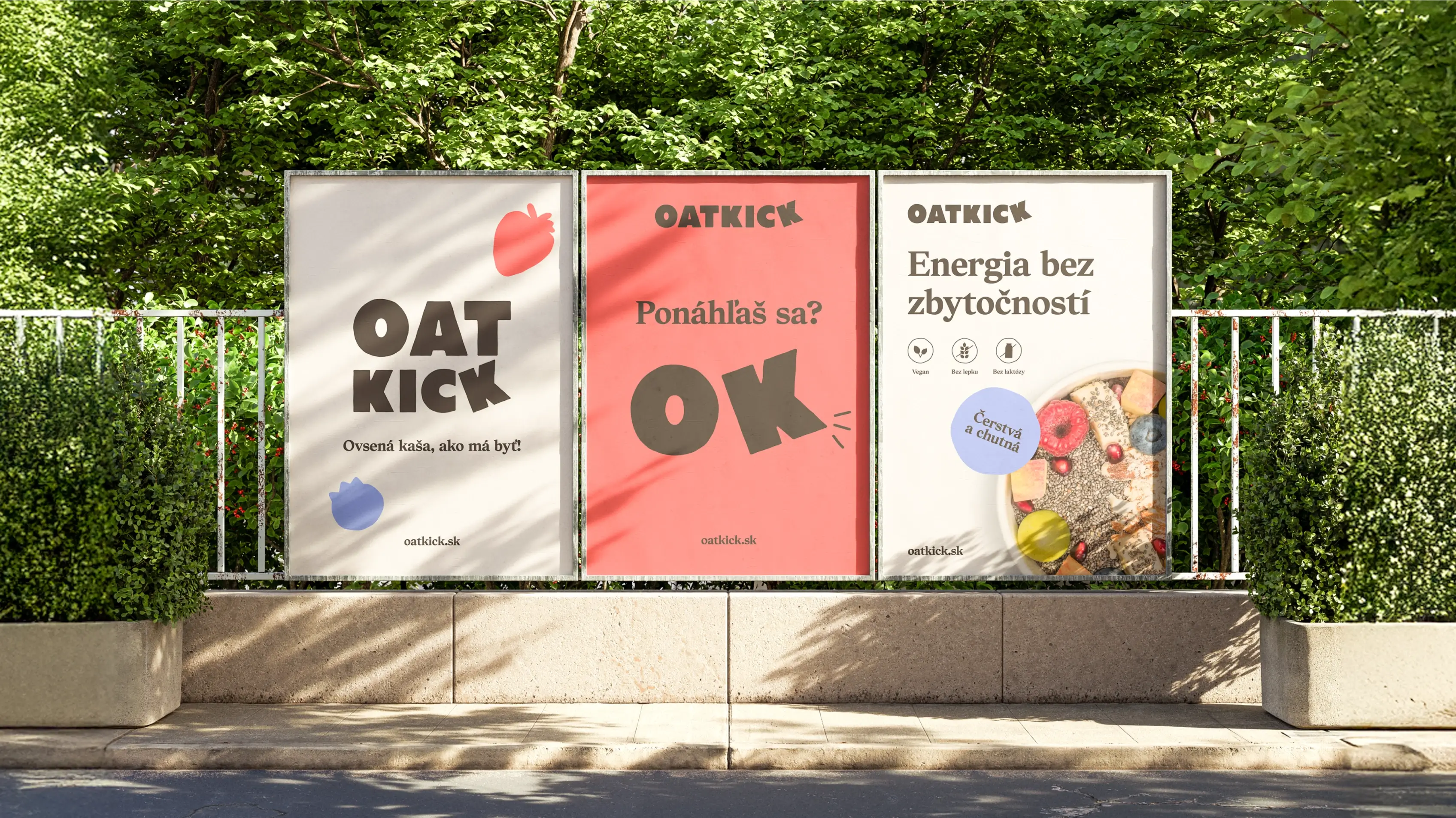
The visual identity balances warmth with energy. Natural, neutral tones keep the brand grounded, while bold red, blue, and yellow bring in a sense of playfulness and joy. And that tilted K in the logo? A small but telling detail—it captures the idea of a cereal that gives you a proper kick.
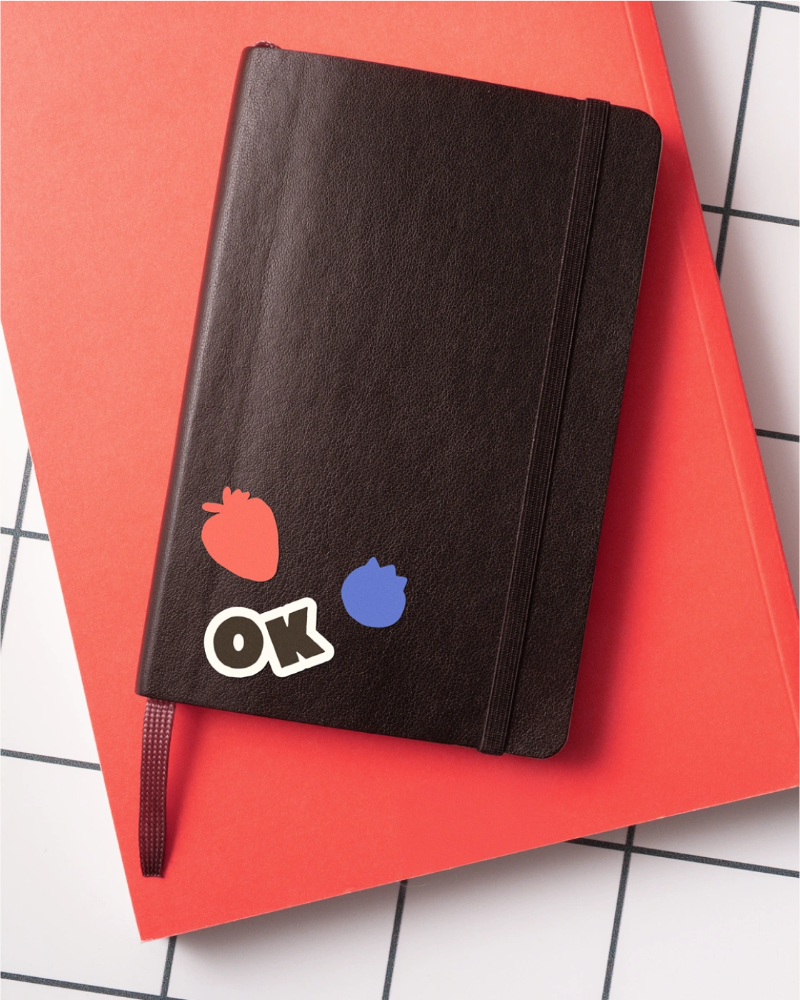
The identity comes to life through bold shapes and fruit stickers that sometimes carry a message, and other times simply set the mood.
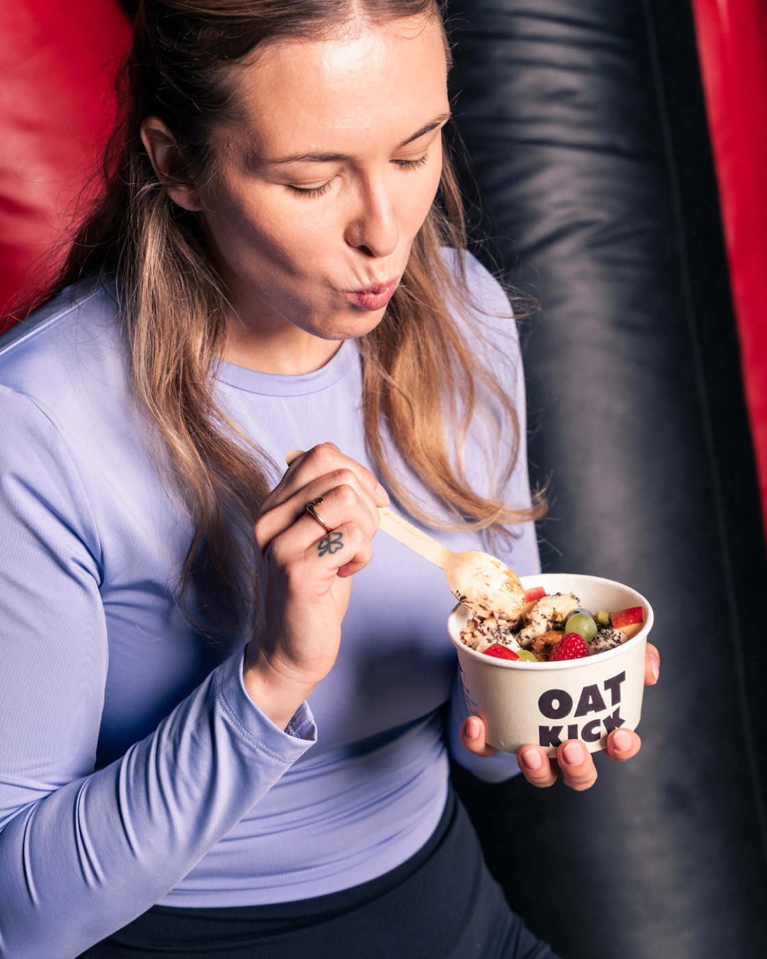
The result? A brand that feels alive, constantly moving, and unapologetically itself—just like the people who love it. Bursting with energy, flavor, and zero compromises.
Roles:
Visual Identity Design
Package Design
Agency Partner:
Studio Birne ↗
Credits:
Brand Strategy: Jakub Hrušovský ↗
Creative Direction: Aneta Marcely ↗
Naming & Verbal Identity: Adriana Takáčová ↗
Photography: Jakub Michal Teringa ↗


 Next Up: Qaxa
Trademark Registration Pending.
Business Register of the City Court Bratislava III
Section: Sro, File No. 179035/B

Made with Love in Europe