" height="50px" id="HiE7YfYjJ" width="50px"/><path d="M 1.612 16.055 C 2.524 16.055 3.224 16.756 3.224 17.669 C 3.224 18.583 2.524 19.284 1.612 19.284 C 0.7 19.284 0 18.583 0 17.669 C 0 16.756 0.7 16.054 1.612 16.054 Z M 10.098 6.856 C 12.228 6.856 13.747 8.378 13.747 10.543 C 13.747 12.708 12.227 14.17 10.097 14.17 C 7.967 14.17 6.448 12.677 6.448 10.543 C 6.448 8.41 7.968 6.856 10.098 6.856 Z M 10.098 21.174 C 12.228 21.174 13.747 22.696 13.747 24.861 C 13.747 27.026 12.227 28.487 10.097 28.487 C 7.967 28.487 6.448 26.994 6.448 24.861 C 6.448 22.728 7.968 21.174 10.098 21.174 Z M 16.454 0 C 18.584 0 20.103 1.522 20.103 3.688 C 20.103 5.852 18.583 7.313 16.453 7.313 C 14.323 7.313 12.804 5.821 12.804 3.688 C 12.804 1.554 14.326 0 16.453 0 Z M 16.454 14.014 C 18.584 14.014 20.103 15.536 20.103 17.701 C 20.103 19.866 18.583 21.327 16.453 21.327 C 14.323 21.327 12.804 19.834 12.804 17.701 C 12.804 15.567 14.324 14.014 16.453 14.014 Z M 16.454 28.027 C 18.584 28.027 20.103 29.549 20.103 31.714 C 20.103 33.879 18.583 35.341 16.453 35.341 C 14.323 35.341 12.804 33.848 12.804 31.714 C 12.804 29.581 14.324 28.027 16.453 28.027 Z M 25.275 1.4 C 26.583 1.4 27.527 2.345 27.527 3.685 C 27.527 5.024 26.583 5.908 25.275 5.908 C 23.967 5.908 23.024 4.995 23.024 3.685 C 23.024 2.375 23.967 1.4 25.275 1.4 Z M 25.275 15.414 C 26.583 15.414 27.527 16.359 27.527 17.698 C 27.527 19.037 26.583 19.922 25.275 19.922 C 23.967 19.922 23.024 19.008 23.024 17.698 C 23.024 16.388 23.967 15.413 25.275 15.413 Z M 25.275 29.427 C 26.583 29.427 27.527 30.372 27.527 31.712 C 27.527 33.051 26.583 33.935 25.275 33.935 C 23.967 33.935 23.024 33.022 23.024 31.711 C 23.024 30.401 23.967 29.427 25.275 29.427 Z M 34.097 2.255 C 34.918 2.255 35.495 2.835 35.495 3.655 C 35.495 4.476 34.916 5.055 34.097 5.055 C 33.277 5.055 32.699 4.476 32.699 3.655 C 32.699 2.835 33.277 2.255 34.097 2.255 Z M 34.097 30.282 C 34.918 30.282 35.495 30.862 35.495 31.682 C 35.495 32.503 34.916 33.083 34.097 33.083 C 33.277 33.083 32.699 32.503 32.699 31.682 C 32.699 30.861 33.277 30.282 34.097 30.282 Z" fill="rgb(61, 106, 0)" height="35.34050042724607px" id="ulPu7wZ0D" transform="translate(5.5 7.5)" width="35.49450158691407px"/></g></svg>)
A mark that changes shape on demand
The founders drew the logo. Then the company started winning real contracts.
Encare supplies electricity, gas and energy advisory to Slovak businesses. From launch in 2019 it reached €8 million in revenue in three years. By the time they came to us in mid-2023, the identity was still the one the founders had drawn at the start.
That's the usual sequence. A brand made to get the first contracts signed, still in place when the company is winning enterprise work, and nobody has time to stop. We ran an Ownership Audit against the rest of the market first. Every supplier in the category looks institutional, and none look adaptable — which is the one thing Encare actually sells.
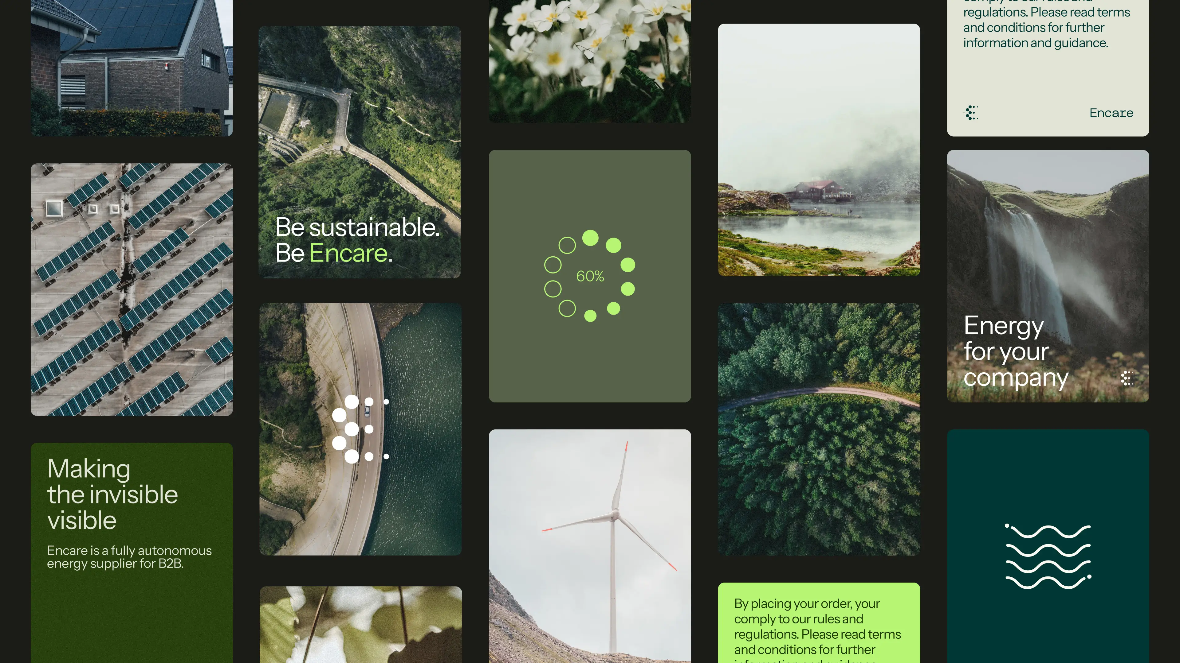
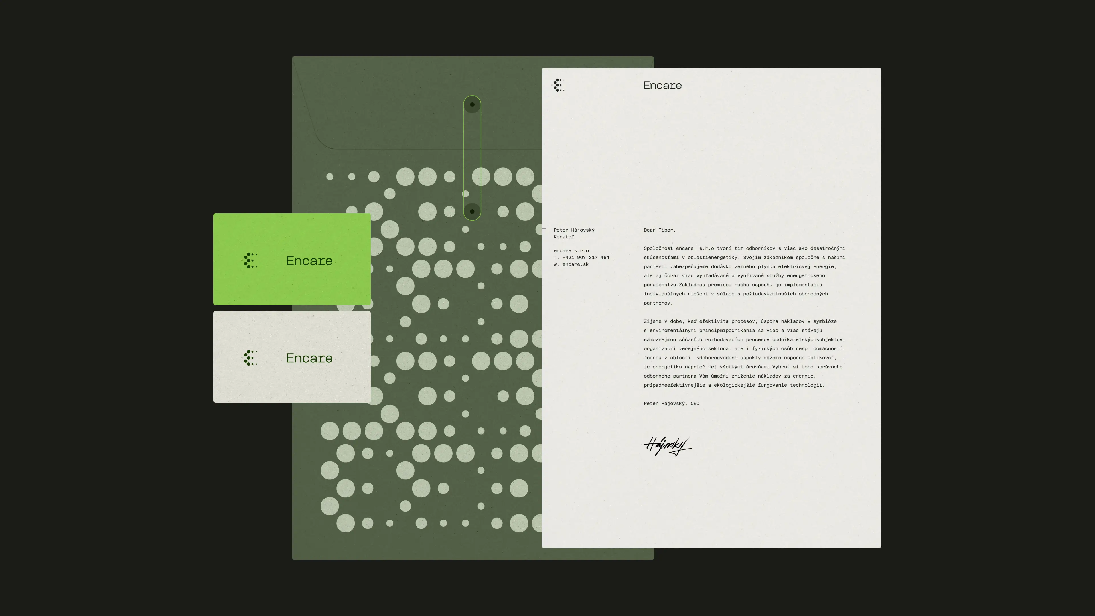
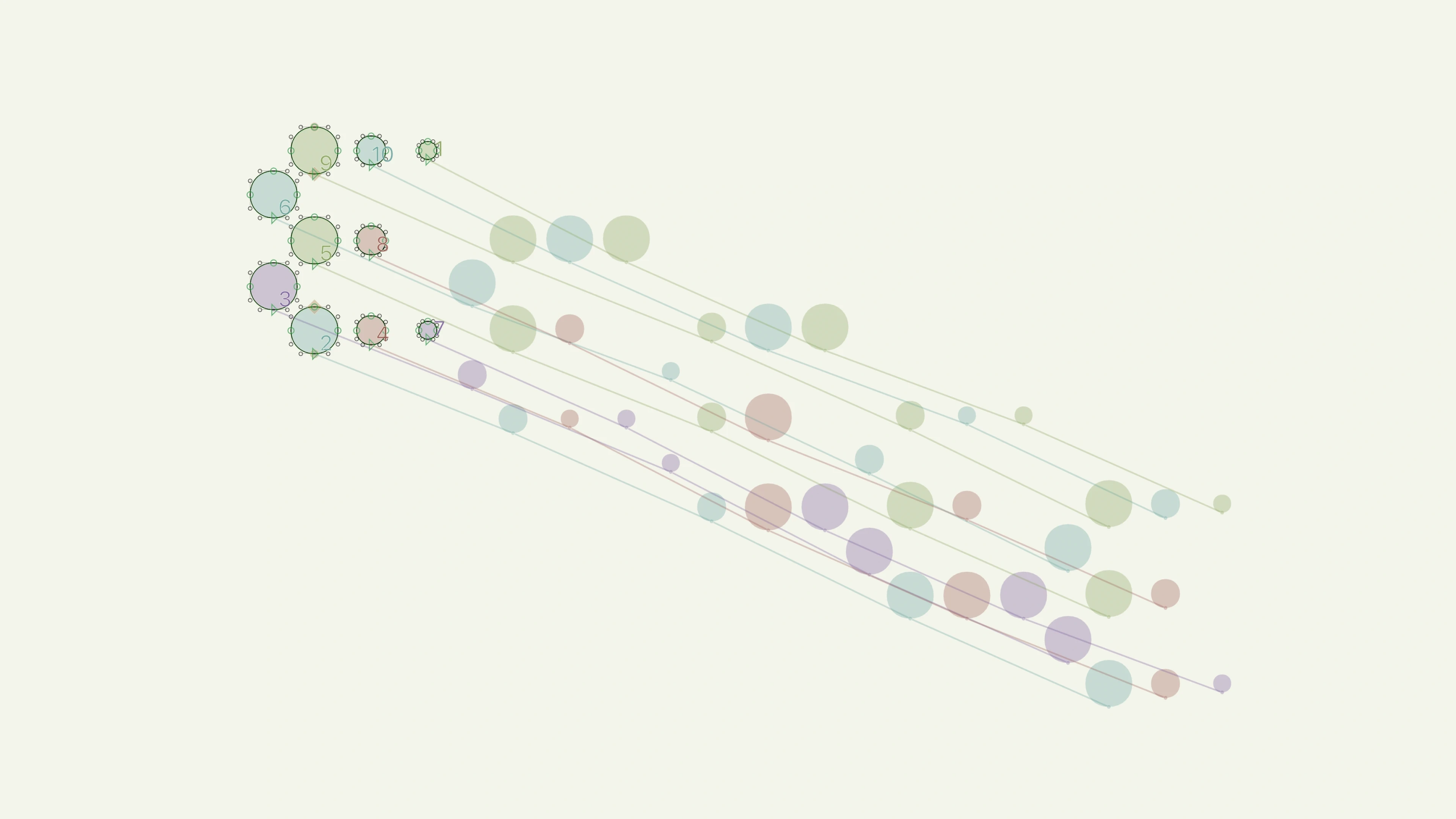
So the symbol morphs. A cluster of dots that redistributes and changes weight, built on a variable typeface so the movement is real rather than a set of alternates. The wordmark was drawn afterwards to accompany the strong mark.
External links: Top 10 Fastest Growing Businesses in Slovakia ↗



Entry

Ownership Audit
What Encare owned before we started
We benchmarked the brand against the Slovak energy market. Nothing in the category signalled adaptability, which was Encare's entire commercial advantage.
Services Include:
Competition Analysis
Asset Ownability Benchmark

Opportunity Analysis & Suggestions
Core

Brand System
The first brand system Encare truly owns
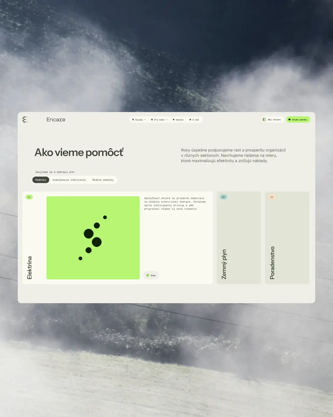
A morphing symbol built on a variable typeface, a drawn wordmark, and a visual system extended into a custom website and motion.
Services Include:
Brand Identity & System Development
Bespoke Wordmarks
Art Direction
Digital Design & Websites
Expand
Continuous Authorship
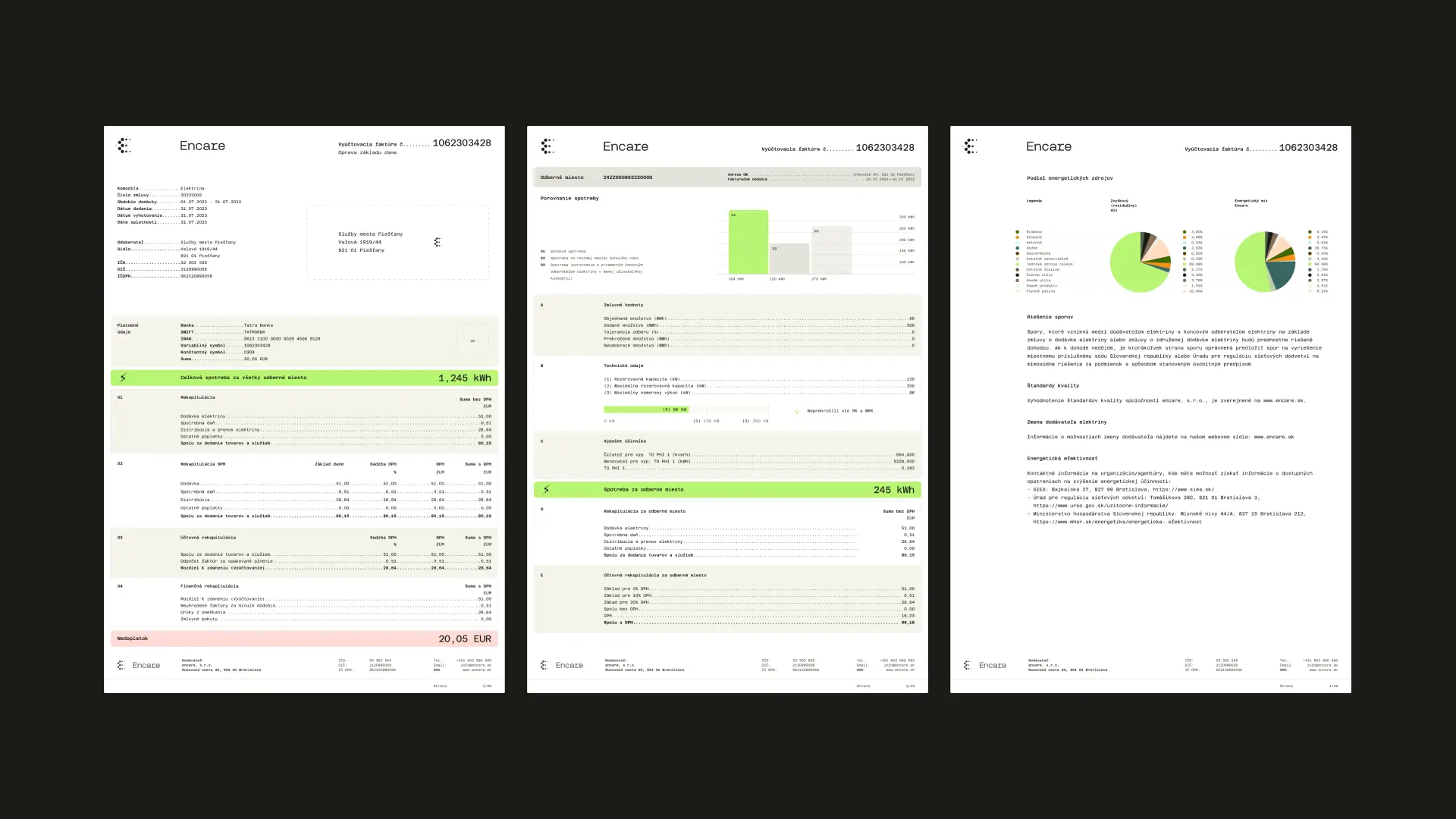
Designing the documents customers actually read
We designed the invoices and consumption statements as a digital product in Figma, built to export from Encare's internal system rather than to be printed.
Services Include:
Digital Design & Websites
" height="50px" id="XZXfGBZG5" width="50px"/><g fill="transparent" height="41.82374678407436px" id="wluXSR3FA" transform="translate(0.923 2.467)" width="47.320679211407494px"><path d="M 0 22.607 L 34.858 0 L 47.321 19.216 L 12.463 41.824 Z" fill="transparent" height="41.82374678407436px" id="EUxwj9LfL" width="47.320679211407494px"/><path d="M 12.257 34.197 C 11.793 34.342 11.289 34.42 10.84 34.493 C 10.328 34.608 9.836 34.71 9.31 34.709 C 8.732 34.679 8.087 34.539 7.547 34.423 C 7.067 34.326 6.601 34.169 6.161 33.955 C 5.176 33.478 4.275 32.846 3.492 32.082 C 2.702 31.332 2.003 30.493 1.407 29.582 C 0.655 28.424 0.217 26.937 0.067 25.419 C -0.02 24.687 -0.022 23.948 0.061 23.217 C 0.181 22.296 0.445 21.4 0.845 20.563 C 1.215 19.796 1.597 18.958 2.188 18.293 C 2.699 17.744 3.323 17.279 3.997 16.841 C 4.803 16.319 5.662 15.978 6.466 15.736 C 7.19 15.516 7.855 15.302 8.538 15.261 C 9.468 15.218 10.467 15.471 11.322 15.691 C 11.962 15.866 12.529 16.12 13.095 16.375 C 13.831 16.707 14.518 17.14 15.135 17.661 C 15.82 18.241 16.403 18.856 16.857 19.556 C 17.226 20.124 17.552 20.722 17.827 21.289 C 18.025 21.689 18.114 22.159 18.231 22.579 C 18.383 23.103 18.551 23.551 18.655 24.044 C 18.793 24.639 18.809 25.28 18.824 25.83 C 18.888 27.311 18.82 27.634 18.251 28.904 C 17.993 29.506 17.69 30.137 17.273 30.688 C 16.508 31.644 15.591 32.47 14.56 33.132 C 13.82 33.612 13.003 33.924 12.25 34.195 Z M 11.7 26.571 C 11.802 26.119 11.784 25.649 11.65 25.207 C 11.513 24.707 11.25 24.255 11.036 23.927 C 10.807 23.576 10.551 23.243 10.269 22.933 C 9.886 22.531 9.449 22.192 8.945 22.085 C 8.524 21.946 8.062 22.005 7.69 22.247 C 7.386 22.445 7.115 22.744 7.011 23.06 C 6.87 23.463 6.953 23.876 7.071 24.39 C 7.187 24.903 7.405 25.478 7.773 26.046 C 8.043 26.461 8.458 26.813 8.843 27.124 C 9.303 27.448 9.744 27.751 10.206 27.793 C 10.535 27.825 10.864 27.743 11.138 27.56 C 11.486 27.335 11.642 26.955 11.703 26.572 L 11.7 26.572 Z M 14.028 13.17 L 14.866 12.012 L 15.822 10.78 L 16.512 9.74 L 17.372 8.598 L 17.731 8.055 C 17.868 7.866 18.087 7.832 18.275 7.97 L 19.521 8.915 L 21.314 10.129 C 21.645 10.339 21.83 10.217 21.656 9.832 L 21.284 9.012 L 20.036 7.004 L 19.576 5.993 C 19.49 5.801 19.483 5.635 19.605 5.466 L 20.135 4.822 L 21.281 3.149 L 22.314 1.812 L 22.897 0.918 L 23.431 0.18 C 23.599 -0.052 23.837 -0.07 23.971 0.19 L 24.731 1.582 L 26.124 3.794 L 27.329 5.995 L 28.839 8.355 C 28.962 8.543 29.067 8.62 29.276 8.642 L 30.639 8.803 L 32.823 9.208 L 34.223 9.363 L 36.357 9.796 L 38.029 10.021 C 38.316 10.07 38.409 10.299 38.24 10.531 L 37.578 11.401 L 36.736 12.651 L 35.438 14.311 L 34.168 16.153 C 34.046 16.323 33.913 16.417 33.683 16.379 L 33 16.299 L 31.443 16.094 L 29.928 15.92 C 29.548 15.866 29.443 16.145 29.758 16.376 L 31.058 17.293 L 32.274 18.28 C 32.462 18.418 32.412 18.576 32.275 18.765 L 31.599 19.654 L 30.619 21.094 L 29.398 22.649 L 28.602 23.836 C 28.465 24.026 28.246 24.06 28.057 23.921 L 26.473 22.73 L 24.493 21.377 L 21.613 19.174 L 19.396 17.616 L 16.256 15.286 L 15.045 14.336 L 14.111 13.716 C 13.922 13.578 13.887 13.358 14.024 13.169 L 14.029 13.169 Z" fill="rgb(255, 255, 252)" height="34.70851913224881px" id="LhdUMY91j" transform="translate(5.529 3.706)" width="38.32444471511928px"/></g></g></svg>)