" height="50px" id="mds8yvOT4" width="50px"/><path d="M 7.55 4.974 L 7.587 4.973 C 7.687 4.943 7.862 4.856 7.969 4.773 C 9.204 5.033 10.119 5.323 11.035 6.489 L 11.186 6.494 C 11.48 5.9 11.79 5.514 12.291 5.124 C 12.758 4.751 13.309 4.499 13.896 4.39 L 13.927 4.244 C 13.011 3.078 12.949 2.126 12.994 0.872 C 13.1 0.789 13.229 0.641 13.281 0.551 L 13.299 0.513 C 13.209 0.338 12.991 0.091 12.797 0 L 12.754 0.008 C 12.566 0.08 12.319 0.296 12.241 0.478 L 12.239 0.504 C 12.291 0.634 12.386 0.754 12.524 0.868 C 12.494 1.33 12.451 2.023 12.166 2.096 C 11.866 2.184 11.496 1.494 11.329 1.063 C 11.43 0.92 11.493 0.754 11.511 0.58 L 11.504 0.538 C 11.312 0.393 11.087 0.299 10.849 0.265 L 10.819 0.289 C 10.652 0.462 10.543 0.682 10.507 0.92 L 10.52 0.935 C 10.64 1.05 10.784 1.138 10.941 1.193 C 11.085 1.593 11.271 2.424 10.981 2.551 C 10.689 2.679 10.234 2.133 9.817 1.601 C 9.856 1.454 9.86 1.3 9.831 1.151 L 9.809 1.121 C 9.587 1.025 9.342 0.995 9.104 1.034 L 9.074 1.059 C 8.978 1.279 8.948 1.522 8.987 1.759 L 9.011 1.789 C 9.15 1.854 9.302 1.886 9.455 1.884 C 9.871 2.414 10.296 2.985 10.1 3.234 C 9.905 3.484 9.14 3.104 8.782 2.867 C 8.764 2.696 8.709 2.531 8.622 2.382 L 8.582 2.365 C 8.339 2.36 8.098 2.42 7.886 2.54 L 7.869 2.579 C 7.856 2.782 7.93 3.094 8.034 3.256 L 8.072 3.274 C 8.23 3.288 8.389 3.265 8.536 3.206 C 8.917 3.471 9.527 3.997 9.37 4.266 C 9.229 4.521 8.541 4.397 8.085 4.314 C 8.022 4.17 7.923 4.045 7.799 3.95 L 7.774 3.946 C 7.576 3.977 7.306 4.162 7.19 4.326 L 7.171 4.366 C 7.214 4.578 7.402 4.846 7.55 4.974 Z M 13.066 5.858 C 14.024 5.158 15.487 5.108 16.496 5.458 C 17.404 5.758 18.615 5.108 19.371 5.858 L 19.321 5.958 C 18.514 6.208 17.455 6.658 16.95 7.608 C 16.345 8.755 15.336 8.805 14.882 9.405 C 12.46 12.403 20.129 19.146 20.431 24.593 C 20.684 28.989 17.152 32.136 12.965 32.286 C 12.712 32.736 12.663 34.834 13.166 35.484 C 13.621 36.084 15.689 35.434 15.285 36.833 L 15.235 36.833 C 13.722 36.233 13.16 36.833 12.101 36.833 C 11.043 36.833 10.392 36.233 8.98 36.833 L 8.93 36.833 C 8.475 35.433 10.594 36.083 10.997 35.483 C 11.503 34.784 11.351 33.185 11.149 32.286 C 7.87 32.136 3.077 28.539 0.05 29.789 L 0 29.689 C 0.253 28.339 1.816 27.19 4.036 27.19 L 4.086 27.14 C 3.531 26.24 2.069 26.141 1.261 26.59 L 1.211 26.54 C 1.665 24.543 4.944 23.444 7.769 22.944 C 14.075 21.844 14.781 18.498 12.814 14.451 C 11.401 11.454 10.291 7.906 13.066 5.858 Z" fill="rgb(47, 49, 5)" height="36.83250013497542px" id="f4NH5SbQL" transform="translate(13.75 5.857)" width="20.44400616203615px"/></g></svg>)
Built to sell from across the room
The look that launched the product couldn't follow it onto new shelves
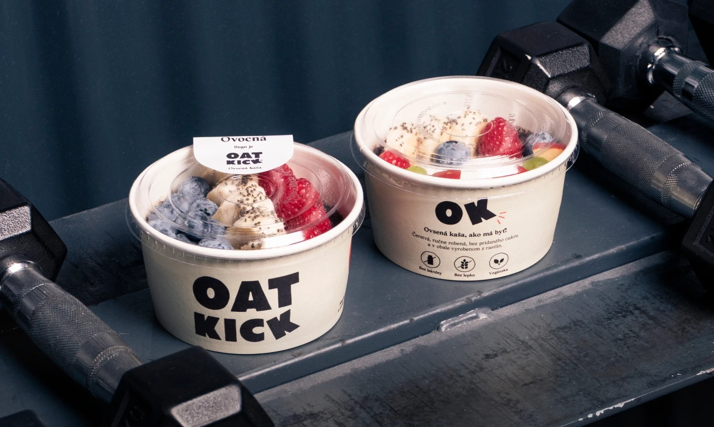
Oatkick makes oat porridge cooked the same day it's sold. When Vlado came to us, the product had just been renamed. The previous name carried an English meaning nobody wanted and needed a look that could travel with it.
The brand had proved itself in bookshops and small independent outlets. Shelves where a customer stands close and has time to read. The channels it was heading into work differently: a cold cabinet gets scanned from across a room, through glass, in a few seconds, beside whatever else is in there.
So the wordmark was redrawn heavier, with enough weight to hold at several metres, and everything around it kept clear so the porridge is the only other thing competing for attention. When the strategy moved to protein and gyms, the system took the shift without a rebuild. We now design the fridges and all supporting collateral it sells from.
Strategy & Naming: Birne
Case Study Photography: Jakub Michal Teringa



Built to sell from across the room
The look that launched the product couldn't follow it onto new shelves
Oatkick makes oat porridge cooked the same day it's sold. When Vlado came to us, the product had just been renamed. The previous name carried an English meaning nobody wanted and needed a look that could travel with it.
The brand had proved itself in bookshops and small independent outlets. Shelves where a customer stands close and has time to read. The channels it was heading into work differently: a cold cabinet gets scanned from across a room, through glass, in a few seconds, beside whatever else is in there.
So the wordmark was redrawn heavier, with enough weight to hold at several metres, and everything around it kept clear so the porridge is the only other thing competing for attention. When the strategy moved to protein and gyms, the system took the shift without a rebuild. We now design the fridges and all supporting collateral it sells from.
Strategy & Naming: Birne
Case Study Photography: Jakub Michal Teringa
Built to sell from across the room
The look that launched the product couldn't follow it onto new shelves
Oatkick makes oat porridge cooked the same day it's sold. When Vlado came to us, the product had just been renamed. The previous name carried an English meaning nobody wanted and needed a look that could travel with it.
The brand had proved itself in bookshops and small independent outlets. Shelves where a customer stands close and has time to read. The channels it was heading into work differently: a cold cabinet gets scanned from across a room, through glass, in a few seconds, beside whatever else is in there.
So the wordmark was redrawn heavier, with enough weight to hold at several metres, and everything around it kept clear so the porridge is the only other thing competing for attention. When the strategy moved to protein and gyms, the system took the shift without a rebuild. We now design the fridges and all supporting collateral it sells from.
Strategy & Naming: Birne
Case Study Photography: Jakub Michal Teringa

Built to sell from across the room
The look that launched the product couldn't follow it onto new shelves
Oatkick makes oat porridge cooked the same day it's sold. When Vlado came to us, the product had just been renamed. The previous name carried an English meaning nobody wanted and needed a look that could travel with it.
The brand had proved itself in bookshops and small independent outlets. Shelves where a customer stands close and has time to read. The channels it was heading into work differently: a cold cabinet gets scanned from across a room, through glass, in a few seconds, beside whatever else is in there.
So the wordmark was redrawn heavier, with enough weight to hold at several metres, and everything around it kept clear so the porridge is the only other thing competing for attention. When the strategy moved to protein and gyms, the system took the shift without a rebuild. We now design the fridges and all supporting collateral it sells from.
Strategy & Naming: Birne
Case Study Photography: Jakub Michal Teringa


Core
Brand System
The first brand system Oatkick truly owns
A wordmark and packaging system built for distance reading, scoped to take new formats and a new positioning without going back to the drawing board.
Services Include:
Brand Identity & System Development
Bespoke Wordmarks

Package Design Systems
Art Direction
Expand
Continuous Authorship
An ongoing collaboration with founder Vlado
We shoot and edit photo and video in-house, plan social content, and brief outside crew when a shoot needs them. Nothing about how the brand looks leaves the room.
Services Include:
Photo & Video Production
Social Media Content Plans
Art Direction Briefs
Package Design Systems
" height="50px" id="t0sbQLF_K" width="50px"/><path d="M 5.214 13.186 C 10.599 13.186 16.011 17.154 16.011 22.683 C 16.011 28.212 10.601 32.18 5.214 32.18 Z M 10.43 5.277 C 10.43 8.327 8.207 10.55 5.215 10.55 C 2.223 10.55 0 8.328 0 5.277 C 0 2.227 2.223 0 5.215 0 C 8.207 0 10.43 2.201 10.43 5.277 Z" fill="rgb(255, 255, 255)" height="32.17999987030029px" id="blKtdLQBH" transform="translate(17.784 8.817)" width="16.01100022506714px"/></g></svg>)