" height="50px" id="JdYS5kzgL" width="50px"/><g fill="transparent" height="37px" id="xbkciipGX" transform="translate(13 7)" width="24px"><path d="M 0 0 L 24 0 L 24 37 L 0 37 Z" fill="transparent" height="37px" id="l9dkQsne1" width="24px"/><path d="M 21.054 17.662 C 21.65 17.662 22.529 17.756 22.968 17.883 C 23.125 18.896 23.344 19.845 23.752 20.858 C 22.622 20.605 21.65 21.27 21.65 22.978 C 21.65 25.226 23.47 25.511 21.744 28.455 C 19.234 26.302 20.301 25.575 20.301 24.118 C 20.301 22.378 19.485 21.206 17.853 21.206 C 15.845 21.206 15.281 23.011 12.143 23.011 C 12.708 26.556 17.791 22.789 18.387 27.568 C 18.732 30.354 19.454 33.234 20.646 36.336 C 18.45 37.506 16.285 36.874 14.056 34.722 L 11.045 31.778 C 8.974 29.752 10.762 25.923 8.346 25.923 C 5.93 25.923 7.53 30.955 0 29.594 C 1.224 27.884 1.914 25.194 2.667 21.713 C 3.985 15.794 6.966 11.553 12.99 11.553 C 14.935 11.553 16.567 11.996 18.073 12.913 L 19.265 11.426 C 20.803 12.439 22.089 14.053 22.748 16.554 C 22.34 16.459 21.838 16.395 21.054 16.395 C 17.32 16.395 14.841 17.06 10.543 19.212 C 14.496 18.01 16.913 17.662 21.053 17.662 Z M 5.711 3.544 C 6.401 4.43 7.279 5.316 8.346 6.139 L 7.499 1.645 C 9.382 0.506 11.233 0 13.461 0 C 17.351 0 21.054 1.583 23.344 4.21 L 17.884 11.3 C 16.337 10.638 14.673 10.293 12.99 10.287 C 7.436 10.287 3.42 13.863 2.134 18.991 C 0.534 12.756 1.882 6.963 5.711 3.545 Z" fill="rgb(255, 255, 255)" height="36.91577741919624px" id="kaVzDm_t8" transform="translate(0.045 0)" width="23.751999999999992px"/></g></g></svg>)
A dog brand that refused cute
The product is better made than the category's look lets it appear
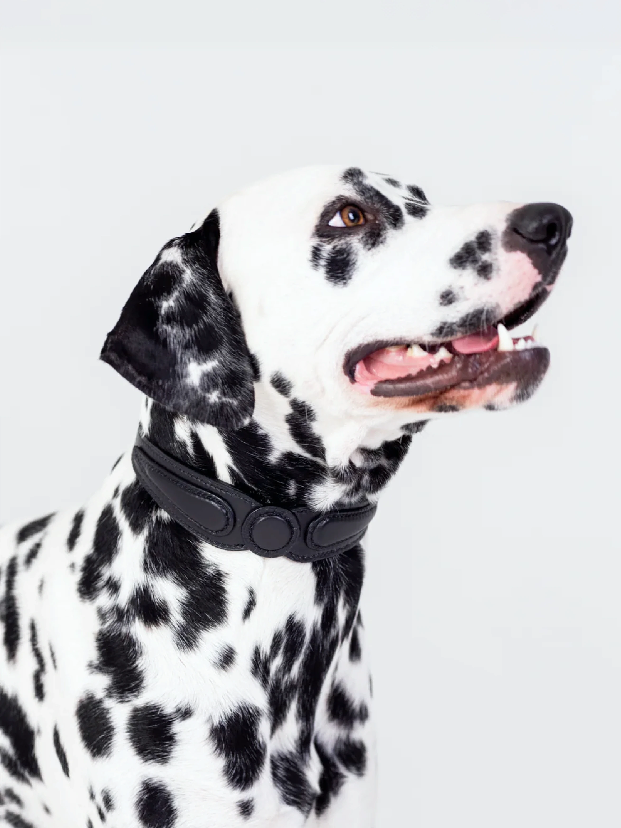
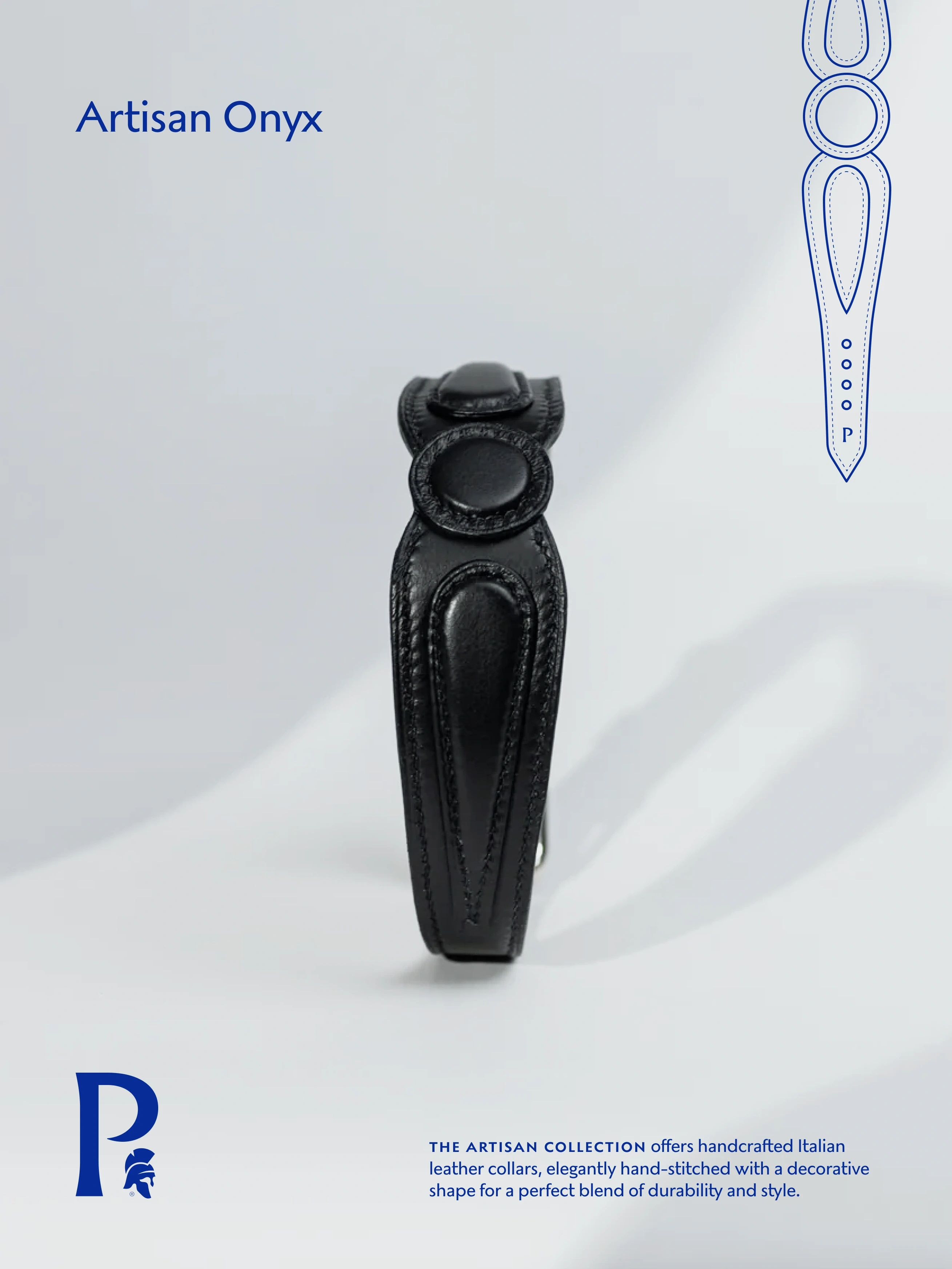
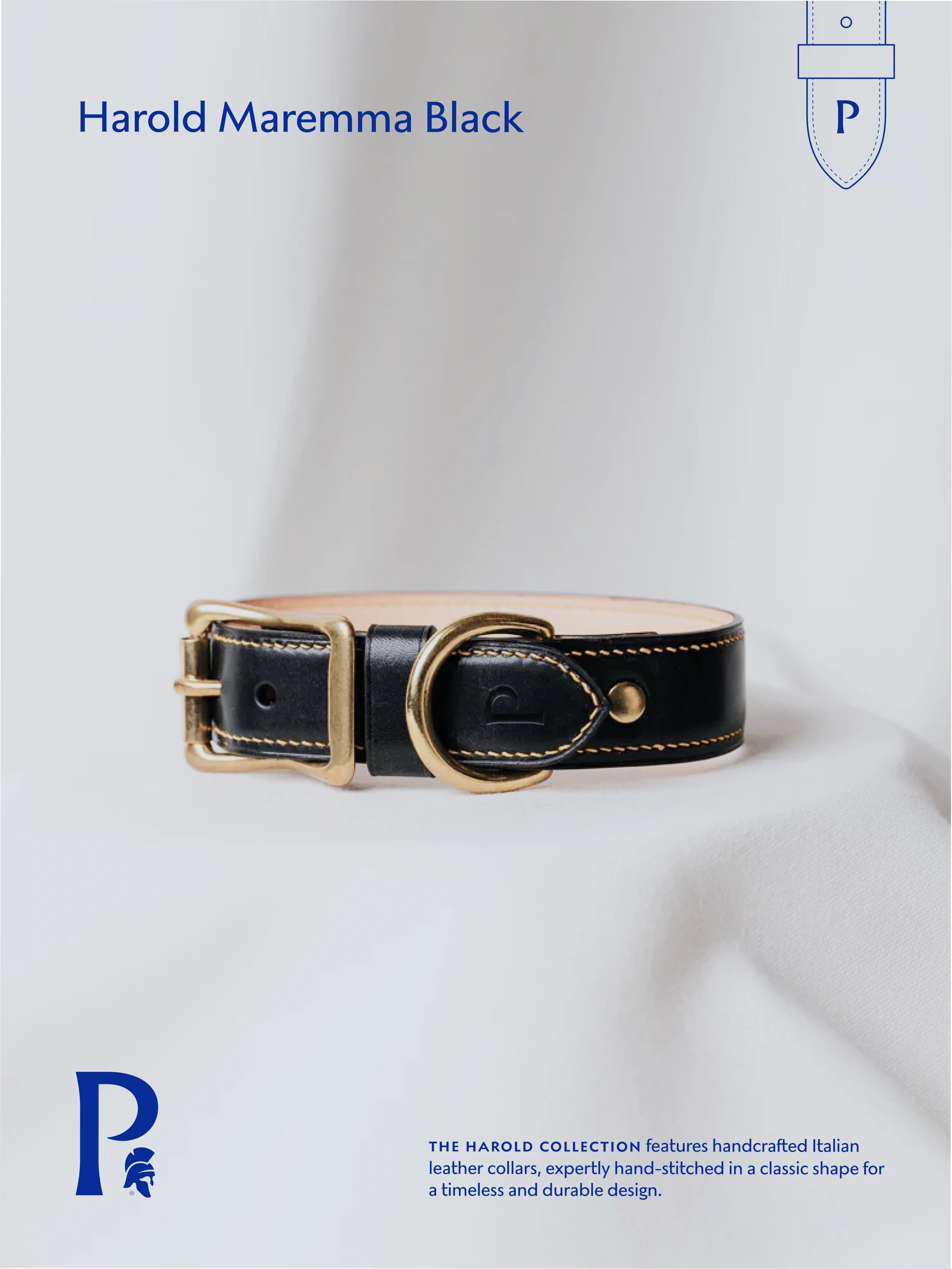
Samuel builds dog goods the slow way. Collars and leads cut and stitched by a single leather artisan to order, beds upholstered by hand. When he came to us the brand didn't exist yet. The product did, and it had nothing to be sold inside.
The category had already decided how this looks. Pastel, mascots, puns, a paw print somewhere. That convention works for supermarket pricing and quietly caps everything above it. A customer paying artisan prices reads cute as inexpensive before they've read the price at all.
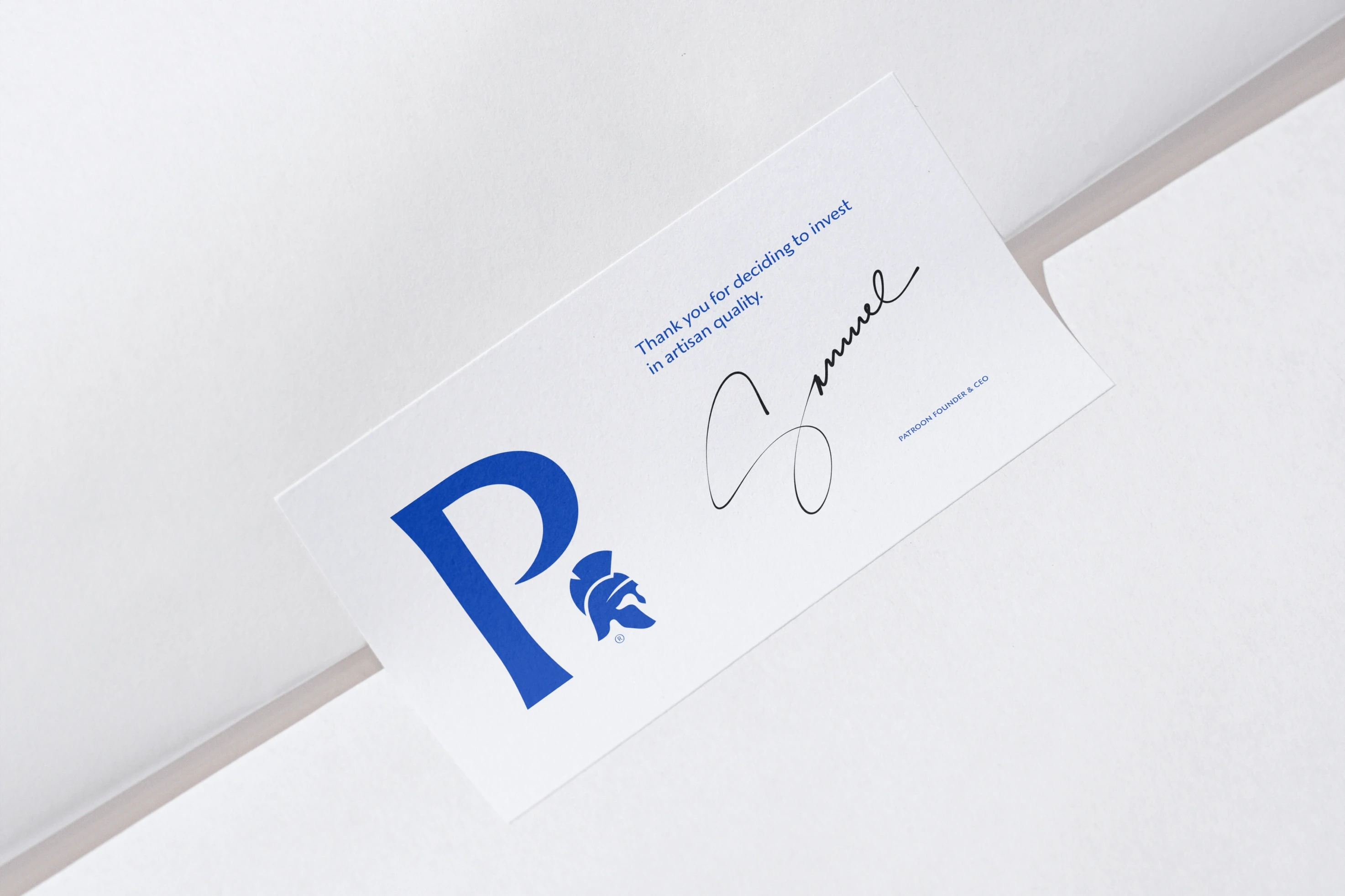
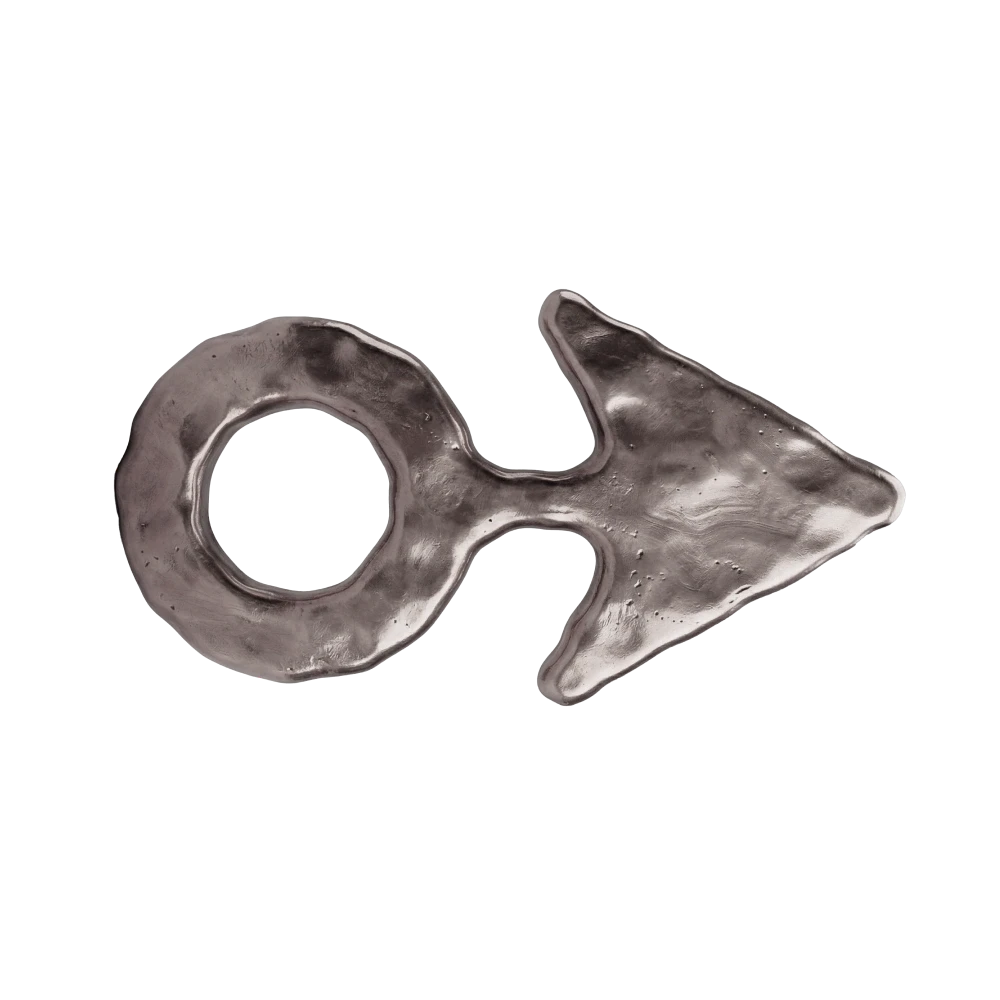
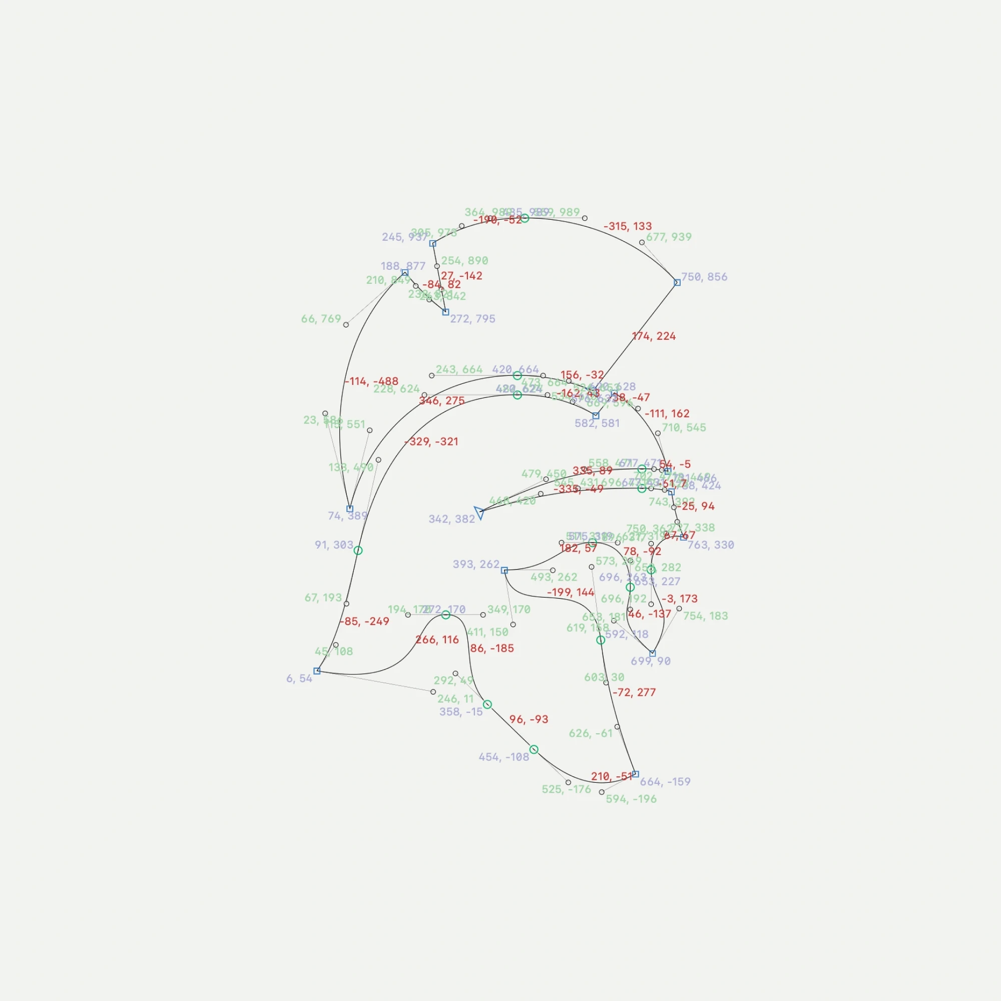
So the symbol went the other way entirely. A helmet, with a dog held in the negative space of the visor. It doesn't announce itself on first look, which is the point: it reads as a mark rather than an illustration, and a mark can be embossed into leather at hardware scale, debossed on a box, and repeated as a pattern.




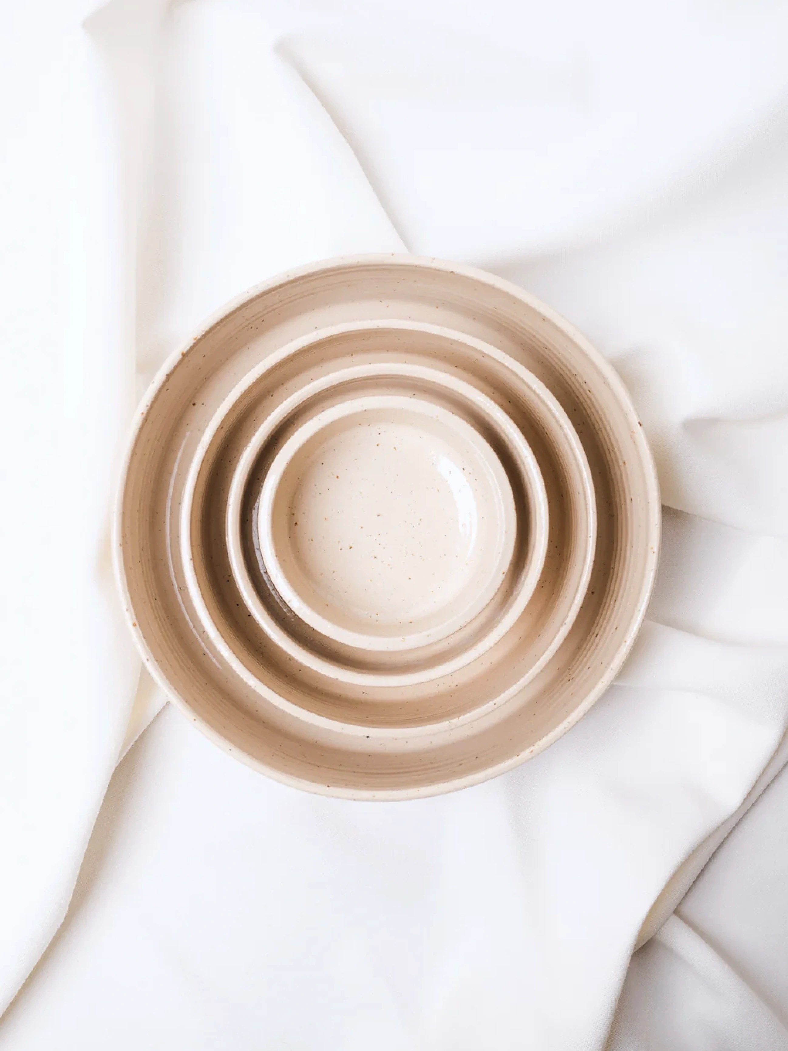
Core
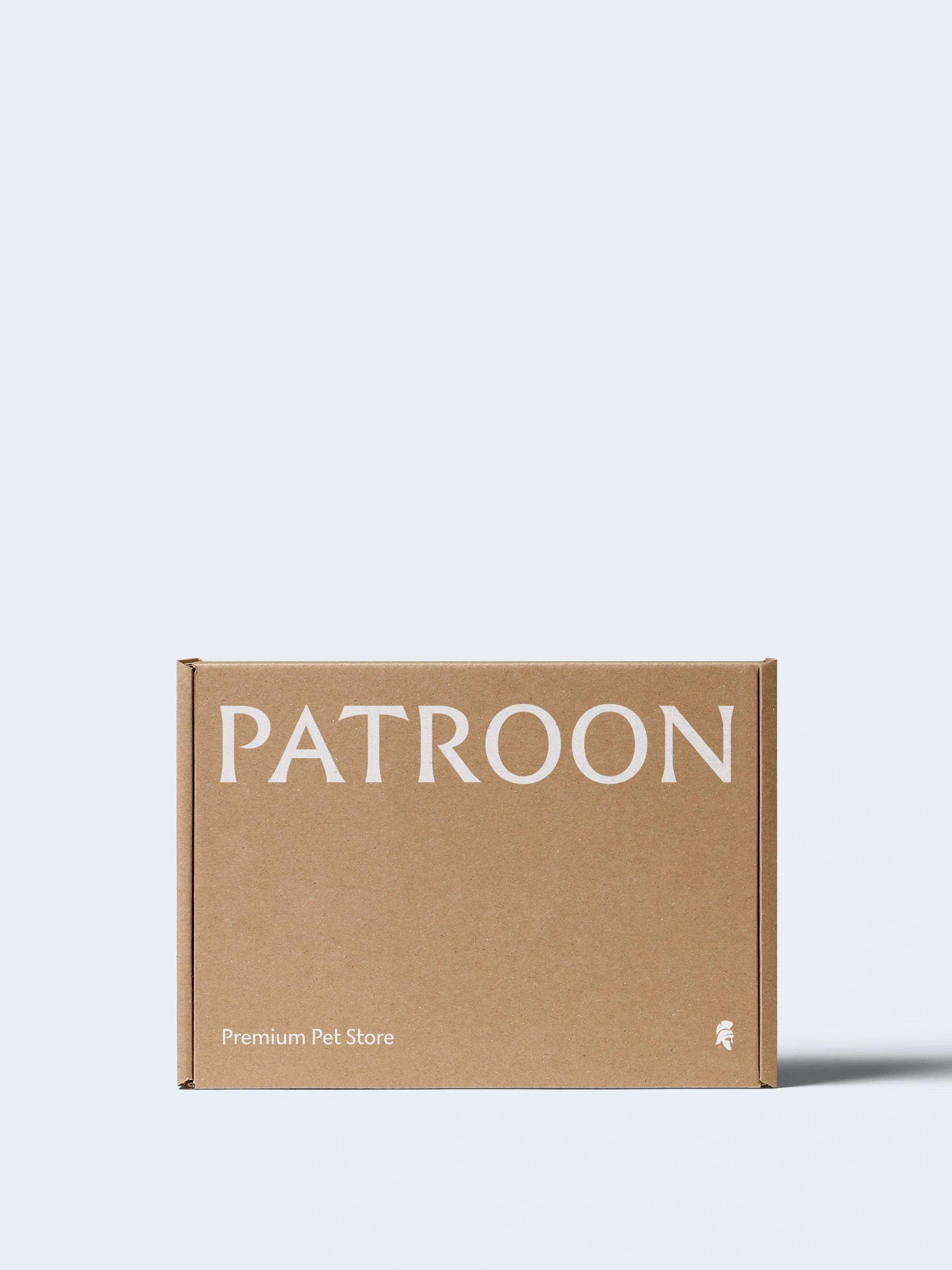
Core — Brand System
The first brand system Patroon truly owns
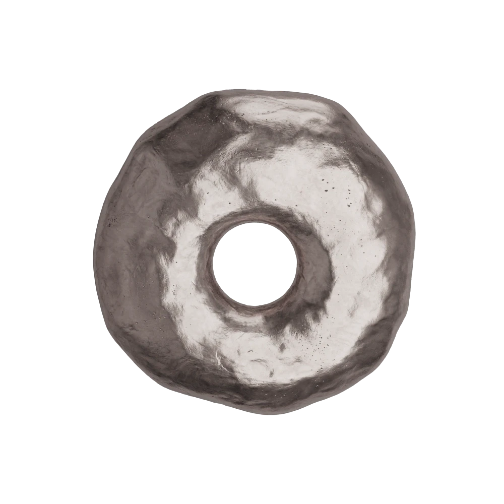
A wordmark, symbol and pattern drawn from scratch, each distinctive enough to survive examination and be registered in the founder's name.
Services Include:
Brand Identity & System Development
Bespoke Wordmarks

Art Direction
Package Design Systems
Expand
Continuous Authorship
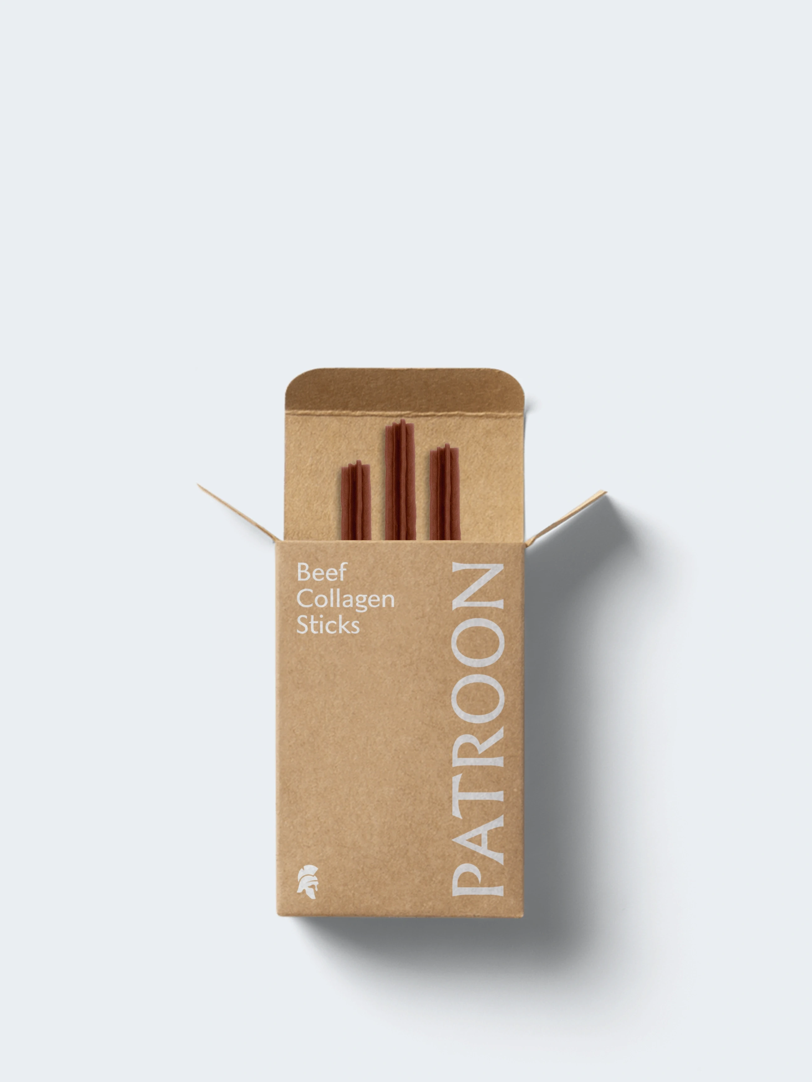
Packaging as the range grew
New pack designs as the brand extended into further products, drawn from the same system rather than around it.
Services Include:
Package Design Systems
" height="50px" id="JPxh0ZBoU" width="50px"/><path d="M 0 13.462 C 0 5.92 5.864 0.04 13.334 0 L 13.408 0 C 20.878 0.039 26.705 5.92 26.705 13.462 C 26.705 16.668 25.585 19.535 23.755 21.834 L 28.537 26.434 C 28.649 26.548 28.723 26.698 28.723 26.811 C 28.723 26.925 28.575 27 28.35 27 L 14.79 27 C 6.163 26.964 0 21.005 0 13.462 Z M 13.745 9.314 C 13.677 9.386 13.583 9.426 13.484 9.426 C 13.385 9.426 13.291 9.386 13.223 9.314 L 10.348 6.411 C 9.906 5.985 9.319 5.742 8.705 5.731 C 7.398 5.731 6.39 6.749 6.39 8.069 C 6.39 8.71 6.65 9.314 7.062 9.728 L 9.938 12.631 C 10.009 12.7 10.05 12.795 10.05 12.894 C 10.05 12.994 10.009 13.089 9.938 13.158 L 6.763 16.402 C 6.331 16.846 6.09 17.441 6.09 18.061 C 6.09 19.381 7.099 20.398 8.406 20.398 C 9.04 20.398 9.639 20.135 10.048 19.719 L 13.223 16.514 C 13.291 16.442 13.385 16.401 13.484 16.401 C 13.583 16.401 13.677 16.442 13.745 16.514 L 16.882 19.719 C 17.318 20.154 17.908 20.398 18.524 20.399 C 19.832 20.399 20.84 19.381 20.84 18.061 C 20.84 17.421 20.54 16.779 20.167 16.402 L 16.992 13.158 C 16.921 13.089 16.88 12.994 16.88 12.894 C 16.88 12.795 16.921 12.7 16.992 12.631 L 19.868 9.728 C 20.291 9.278 20.531 8.687 20.541 8.069 C 20.541 6.749 19.532 5.732 18.225 5.732 C 17.612 5.743 17.025 5.985 16.583 6.411 L 13.743 9.314 Z" fill="rgb(31, 27, 19)" height="27px" id="SL5HdnuWN" transform="translate(11 11)" width="28.722999999999992px"/></g></svg>)